SA01 Statistical Analysis Two Products
The present post covers the analysis of the data for the sales of two products: Product1 and Product2, and the independent variables that may affect the sales: StockPrice (numerical), MarketingSpend (numerical), Price (numerical), and date of the week (categorical) and Method (categorical).
Link to the Complete Script in Github
Contents
- Read Data CSV file
- Descriptive Statistics
- Comparative Statistics
- Associative Statistics
- Predictive Statistics
Read Data CSV file
First 10 records
The next is a view of the first 10 from a 62 records data:
| Date | Day | Method | Product1 | Product2 | StockPrice | MarketingSpend | Price | Sales | Revenue |
|---|---|---|---|---|---|---|---|---|---|
| 7/1/2016 | Friday | M01 | 97 | 67 | 70 | 90 | 0.25 | 164 | 41 |
| 7/2/2016 | Saturday | M01 | 98 | 67 | 72 | 90 | 0.25 | 165 | 41.25 |
| 7/3/2016 | Sunday | M01 | 110 | 77 | 71 | 104 | 0.25 | 187 | 46.75 |
| 7/4/2016 | Monday | M02 | 134 | 99 | 76 | 98 | 0.25 | 233 | 58.25 |
| 7/5/2016 | Tuesday | M02 | 159 | 118 | 78 | 135 | 0.25 | 277 | 69.25 |
| 7/6/2016 | Wednesday | M02 | 103 | 69 | 82 | 90 | 0.25 | 172 | 43 |
| 7/7/2016 | Thursday | M02 | 143 | 101 | 81 | 135 | 0.25 | 244 | 61 |
| 7/8/2016 | Friday | M02 | 123 | 86 | 82 | 113 | 0.25 | 209 | 52.25 |
| 7/9/2016 | Saturday | M02 | 134 | 95 | 80 | 126 | 0.25 | 229 | 57.25 |
| 7/10/2016 | Sunday | M02 | 140 | 98 | 82 | 131 | 0.25 | 238 | 59.5 |
The data contains 31 records for 2016, and 31 records for information of the same day but year 31 records that will serve for comparison of paired two-sample.
Descriptive Statistics
Data Summary
The next are the results applying the summary to the data:
Statistics for Numerical variables
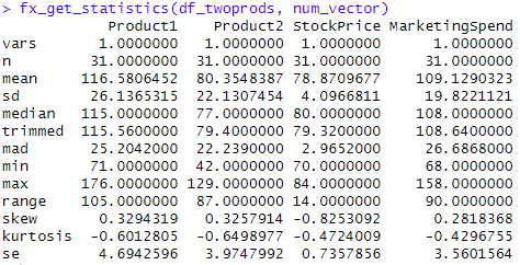
Checking other statistics, specially skewness and kurtosis:
1
2
3
4
5
6
7
8
9
10
11
12
13
14
15
16
17
18
# Function to calculate statistics
# Using psych::describe to get the statistics kurtosis, skewness
fx_get_statistics <- function(data, numeric_vector){
  results_df <- data.frame()   # Create an empty df to store the results
  for (ii in numeric_vector) {
    desc <- psych::describe(data[, ii])
    rownames(desc) <- ii
    results_df <- rbind(results_df, desc)
  }
 print(t(results_df))
}

# Numeric columns
str(df_twoprods)

num_vector <- c("Product1", "Product2", "StockPrice", "MarketingSpend")

fx_get_statistics(df_twoprods, num_vector)
Skewness and Kurtosis
All the numerical values show values in the range of <-1,+1> so they can be assumed as normally distributed.
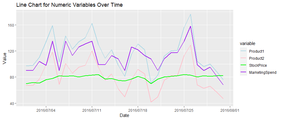
Create a line chart for all numerical variables
Melting the four numerical values “Product1”, “Product2”, “StockPrice”, “MarketingSpend” to the column variable
1
2
3
4
5
6
7
8
9
10
11
12
13
14
15
16
17
melted_data <- melt(df_twoprods[,c("Date", num_vector)],
                  id.vars = "Date")
head(melted_data)

ggplot(data = melted_data, aes(x = Date, y = value, color = variable, group = variable)) +
  geom_line(linewidth = 1) +
  labs(
    title = "Line Chart for Numeric Variables Over Time",
    x = "Date",
    y = "Value"
  ) +
  scale_x_date(date_labels = "%Y/%m/%d", date_breaks = "1 week") +
  scale_color_manual(values = c("Product1" = "lightblue",
                                "Product2" = "pink",
                                "StockPrice" = "green",
                                "MarketingSpend" = "purple"))
Chart: Daily Change of Values for Numerical Variables
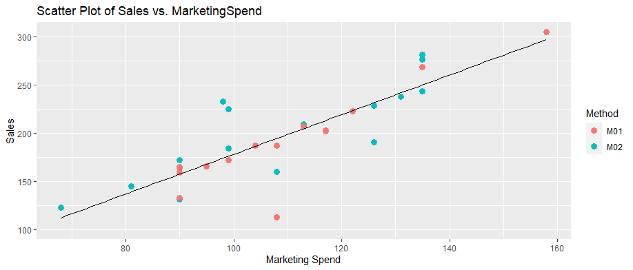
Function: Scatter Plot Sales vs Marketing Spend
From the previous graph it appears to be a correlation between sales and MarketingSpend.
1
2
3
4
5
6
7
8
9
10
11
12
ggplot(data = df_twoprods, aes(x = MarketingSpend,
                               y = Sales, color = Method)) +
  geom_point(size = 3) +  # Use points for the scatter plot
  # Add linear regression line
  geom_smooth(method = "lm", se = FALSE, color = "black", linewidth=0.5) +
  labs(
    title = "Scatter Plot of Sales vs. MarketingSpend",
    x = "Marketing Spend",
    y = "Sales"
  ) +
  expand_limits(x = 70, y = 100)
Chart: Scatter Plot Sales vs Marketing Spend
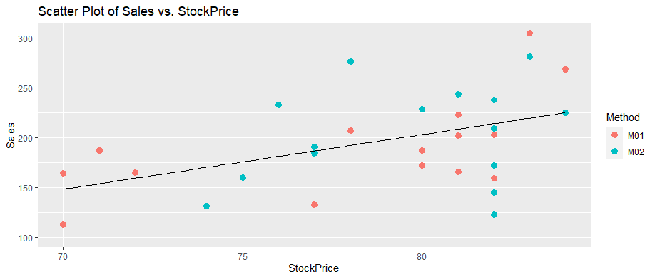
Chart: Sales vs StockPrice
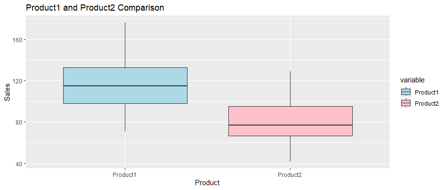
Chart: Box Plot of Two Products
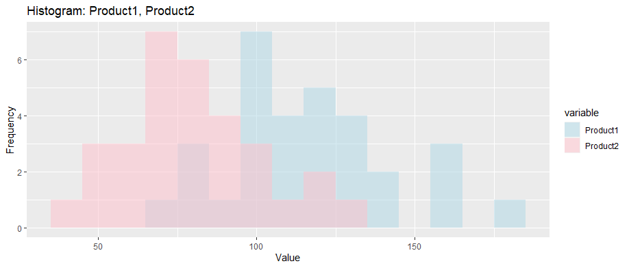
Chart: Histogram of Two Products
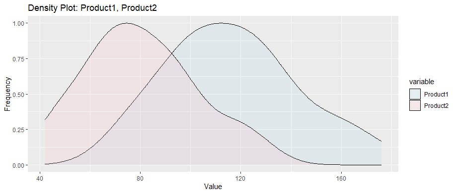
Chart: Density Plot of Two Products
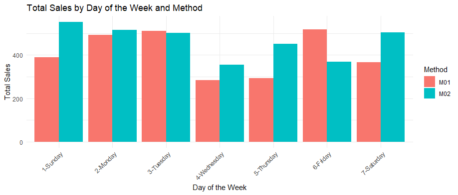
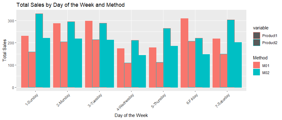
Chart: Bar Plots Sales by Weekday vs Method
Chart: Bar Plots Sales of Product1 and Product2 by Weekday and Method
Comparative Statistics
Comparison of Sales vs Historical Data of daily Sales. For that purpose is useful the T-test.
T-test: It is typically implemented on small samples.
It is assumed that the historical daily dsaleThe calculated historical mean for the daily sales: 124.29
The next chart shows a box plot distribution of daily sales for Product1, Product2 and historical values:
Chart: Box plot distribution of daily sales for Product1, Product2 and historical values
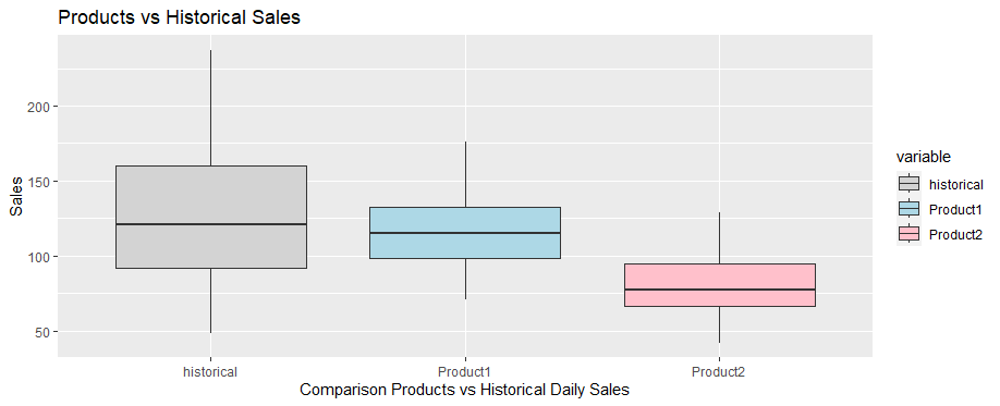 Distribution of sales Product1, Product2 and historical
Hypothesis Testing T-test
By the results the Product1 looks closer to the historical values while Product2 appears to be much lower. In order to find out the t-test is applied.
For product1 T-test two sided
- Null Hypothesis: The current sales and the historical sales have the same mean.
- Alternative Hypothesis: The current sales and the historical sales have the same mean.
1
2
3
t.test(x=df_twoprods$Product1,
       mu=historical_mean,
       alternative = "two.sided")
It results in the next: data: df_twoprods$Product1
t = -1.6428, df = 30, p-value = 0.1109
alternative hypothesis: true mean is not equal to 124.2923
95 percent confidence interval:
106.9937 126.1676
sample estimates:
mean of x
116.5806
The 95 % confidence interval range contains also the historical value. As the p-value 0.1109 is higher than 0.05, the Null Hypothesis can not be rejected.
For product2 T-test Lower
- Null Hypothesis: The sample is NOT lower than the historical sales
- Alternative Hypothesis: The sample is LOWER than the the historical sales mean
1
2
3
t.test(x=df_twoprods$Product2,
       mu=historical_mean,
       alternative = "less")
It results in the next:
data: df_twoprods$Product2
t = -11.054, df = 30, p-value = 2.109e-12
alternative hypothesis: true mean is less than 124.2923
95 percent confidence interval:
-Inf 87.10111
sample estimates:
mean of x
80.35484
The 95 % confidence interval range doesn’t contain the historical value. As the p-value 2.109e-12 is much lower than 0.05, the Null Hypothesis is rejected. Effectively the sales in product2 are lower than the historical sales.
Hypothesis Testing two Sample T-test
Two-sample t-tests are used to directly the two products’ sales and determine if a statistically significant difference exists, hence confirming the previous results. The two-sample t-test will let us answer the question: Were the Product1 sales higher than the the Product2 sales?
Two sample T-test
- Null Hypothesis: Product1 sales are less or equal than Product2 sales (negative or zero difference)
- Alternative Hypothesis: true difference in means is greater than 0
1
2
3
t.test(df_twoprods$Product1,
       df_twoprods$Product2,
       alternative = "greater", var.equal=TRUE)
data: df_twoprods$Product1 and df_twoprods$Product2
t = 5.8894, df = 60, p-value = 9.393e-08
alternative hypothesis: true difference in means is greater than 0
95 percent confidence interval:
25.9496 Inf
sample estimates:
mean of x mean of y
116.58065 80.35484
The 95 % confidence interval range doesn’t contain zero, but it says it is higher than 25.9496. With a p-value = 9.393e-08, much lower than 0.05, the Null Hypothesis is rejected. Effectively the product2’sales in are lower than product1’s sales.
Paired Two Samples T-test
The next is a paired Comparison of Sales for the same days on years 2015 - 2016. In 2015 there were not MarketingSpend on 2015, so the impact of this factor will be measured in this test.
Chart: Sales_2015_2016
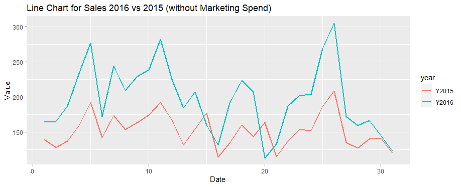 Distribution of sales by calendar day 2015 vs 2016
Hypothesis:
- Null Hypothesis: No statistically significant difference
- Alternative Hypothesis: true mean difference is not equal to 0
1
t.test(df_twoprods$Sales, df_twoprods_2015$Sales, paired = TRUE, alternative = "two.sided")
data: df_twoprods$Sales and df_twoprods_2015$Sales
t = 7.8569, df = 30, p-value = 9.088e-09
alternative hypothesis: true mean difference is not equal to 0
95 percent confidence interval:
33.32690 56.73762
sample estimates:
mean difference
45.03226
The 95 % confidence interval range doesn’t contain zero, but the difference falls in a range <33.3,56.7>. The probability to see this difference for the null hypothesis is p-value = 9.088e-08, much lower than 0.05, the Null Hypothesis is rejected. Effectively there is a positive difference between the sales in 2016 compared to 2015 sales.
Multi-way ANOVA
Multi-way ANOVA involving three or more independent variables. The next test will provide information on the main effects and interactions of the independent variables “Method,” “StockPrice” and “MarketingSpend” on “Sales”.
1
2
3
4
5
anova_result <- aov(Sales ~ Method + StockPrice + MarketingSpend,
                    data = df_twoprods)

# Print the ANOVA summary
summary(anova_result)
Results of Multi-way ANOVA:
Interpretation of Multi-way ANOVA Results:
Method: p-value = 0.149. Since it is greater than 0.05, we fail to reject the null hypothesis for “Method.” This suggests that there may not be a statistically significant difference in “Sales” between the methods M01 and M02.
StockPrice: p-value 3.34e-05 indicates strong evidence against the null hypothesis. Therefore, “StockPrice” appears to have a significant effect on “Sales”.
MarketingSpend: p-value 7.50e-09. This indicates a highly significant effect of “MarketingSpend” on “Sales”.
Associative Statistics
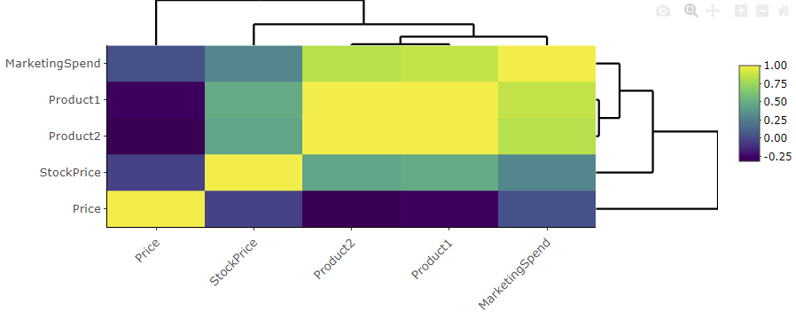
Using the cor() function to calculate the correlation matrix. This will calculate the pairwise correlations between all numerical columns.
The result, correlation_matrix, will be a square matrix where each cell contains the correlation coefficient between two variables.
Correlation Matrix
1
2
cor(df_twoprods[,c("Product1", "Product2",
             "StockPrice", "MarketingSpend", "Price")])
Visualization - Heatmap
1
heatmaply::heatmaply(correlation_matrix, colorScale = "magma")
The correlation between “Product1” and “MarketingSpend” is approximately 0.860. This indicates a strong positive correlation between Product1’s sales and marketing spending. Higher marketing spending is strongly associated with higher sales for Product1.
The correlation between “Product1”. “Product2” and “Price” is negative.
Predictive Statistics
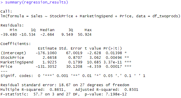
Code for Linear Regression
1
2
regression_results <- lm(formula = Sales ~ StockPrice + MarketingSpend + Price,
   data = df_twoprods)
Summary of Results
The provided regression results, including the Intercept and Coefficients for ‘StockPrice,’ ‘MarketingSpend,’ and ‘Price,’ allow us to create a predictive model for Sales. This model can be used to make forecasts and understand how changes in these variables impact Sales.
__
End of Post

