DP15 Examples BarPlots ggplot
Description
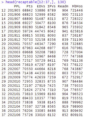
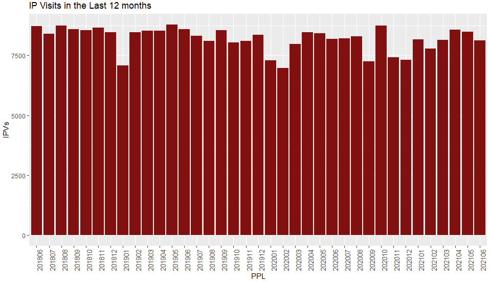
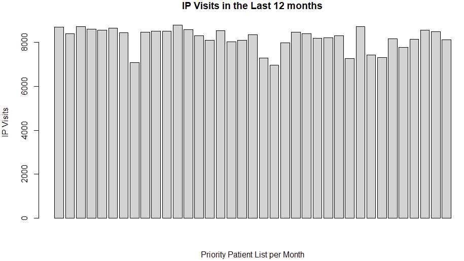
In this post, there are charts that show variations in data using bar plots. The first one utilizes the bar plot from the base package, and finally, the ggplot barplot is presented. In the present example, the data corresponds to population enrollment, Emergency Department (ED) visits, Inpatient (IP) visits, and readmissions over the past 12 months.
Link to the Complete Script in Github
R Script - Examples BarPlots ggplot
Initial Data

15_Data_BarPlots
Bar Plot (base)
1
2
3
4
barplot(recaptable$IPVs,
        main="IP Visits in the Last 12 months",
        xlab = "PPL",
        ylab = "IP Visits", col = 'lightgray')
Bar Plot with ggplot
1
2
3
4
5
6
7
# ggplot2 plot with modified x-axis labels
# ggplot: With x-axis labels
ggplot(recaptable, aes(PPL, IPVs)) +
  geom_bar(stat = "identity", fill = "#990000") +
  theme(axis.text.x = element_text(angle = 90, size = 10)) +
  ggtitle("IP Visits in the Last 12 months")

__
End of Post
This post is licensed under CC BY 4.0 by the author.
